Coffee Lab Transition Story
Coffee Lab
Inspiration is like coffee. You get one or two cups daily that produce electric effects. The liquid black magic powers your day. Waking up in the morning, you crave a caffeine kick to propel your creative juices into overdrive.
Streams of golden brown caffeine liquid flow into steam-heated cups. You feel alert and buzzing with responsive energy with caffeine shots to flow into your day. Many things affect the fragrance and taste of your coffee. The coffee bean region and roasting give your coffee its unique personality.
Coffee Lab Transition Story
Coffee lab coffee has a lot of personality. Personality goes a long way in the coffee and the coffee roaster.When the roaster at Coffee Lab changed, Daniela understood it had a character that needed an expression. She took over the roasting of the beans and recognized a vibrant array of colourful coffee characteristics.
To express its vibrant characteristics, the coffee brand needed more personality. Coffee Lab needed a new look.
The original brand was black and white. The packaging was dense, craving fluidity.
Daniela started the work with an innovative design team to express the character of each origin. New colourful designs embody fluidity, flavour and tone.
How It started

A New Coffee Lab Logo
The Logo: The Star is a Halo. It symbolizes a Light giver.
The typography lettering wrote itself into a well-balanced flow. Coffee steaming from a cup morphed into the logo's curvy line.
The Punctuation. Coffee Lab coffees fill moments, punctuating your day.
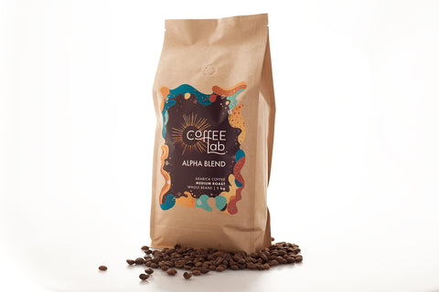
The labels evolved with trial and error. You will notice a strong presence of mid-century colour combinations when you pick up your coffee pack.
A swirl of colour with different shapes, textures and movements blends into each design, giving the plasma depth and meaning.
Each blend presented with a unique fluid movement, colour combination and patterns.
The New Look
